The On-the-Job Training Experience of Niña Mae C. Enero Acknowledging Dedication in IT On-the-Job Training. During her on-the-job training period, she demonstrated consistent dedication and a strong sense of responsibility in fulfilling …

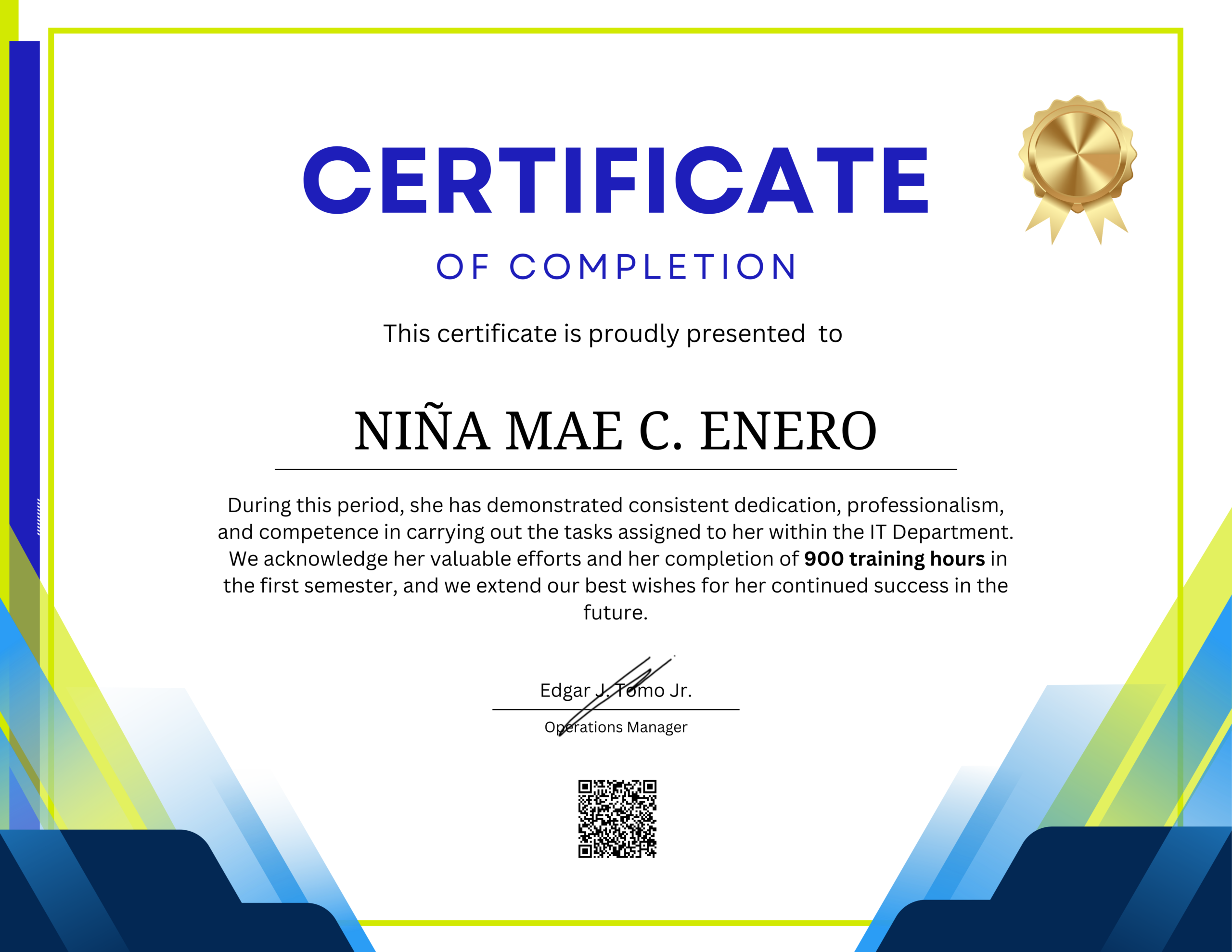
The On-the-Job Training Experience of Niña Mae C. Enero Acknowledging Dedication in IT On-the-Job Training. During her on-the-job training period, she demonstrated consistent dedication and a strong sense of responsibility in fulfilling …

The On-the-Job Training Experience of Chrisfel Zeye F. Mendoza Introduction. On-the-Job Training (OJT) plays a vital role in preparing students for the professional world by allowing them to apply academic knowledge in …